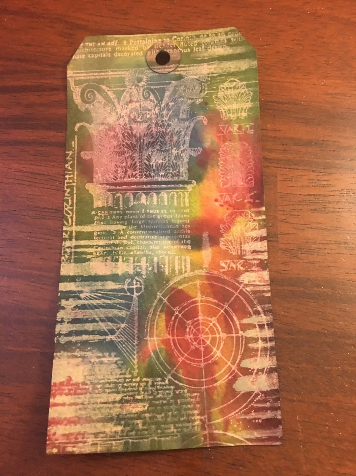
This technique makes me want to order an entire tub of white distress crayons. Rubbing and smooshing it into a stencil and then spraying distress inks over the top makes for a lovely translucent background with a slightly raised texture from the crayon.
Thursday, August 4, 2016
Day 4 Creative Chemistry Distress Crayon Texture Resist
Distress Crayon Texture Resist
This technique makes me want to order an entire tub of white distress crayons. Rubbing and smooshing it into a stencil and then spraying distress inks over the top makes for a lovely translucent background with a slightly raised texture from the crayon.
Day 4 Creative Chemistry Distress Crayon Smudge
Distress Crayon Smudge-
I really like the texture of this tag. It is fun to add color and smudge it in the patterned design.
Tuesday, August 2, 2016
Day 2 Creative Chemistry Distress Luminous Mica
Distress Luminous Mica-- I love the stainglass window coloring of using multicolor distress minis to create a mottled background. The mica spray is just a beautiful sheen that draws you in of this technique. A little mica goes a long way.
Day 2 CC103 Distress Paint Lift
Distress Paint Lift
I really like the smooth finish of this card. It definitely takes practice not use too much paint so it doesn't ooze under the stencil. I really like the lace and cells parts of this tag best.
Day 2 Creative Chemistry Distress PAINT Resist
Distress Paint Resist
Stamping with Distress Paint makes me a little nervous because of its quick drying time- but it so worth it for this technique. Stamping with paint and inking over with inks. Yummy. My husband loved this tag. He thinks it looks like old or international money. I love the velvety look of it myself too.
Monday, August 1, 2016
Creative Chemistry 103 Day 1
I've been waiting all summer for Creative Chemistry 103. Tim Holtz is such a creative and wonderful soul. I hope I do his techniques justice.
I was looking forward to using the Picket Fence Distress Ink pad. This technique makes your other distress ink colors pop on darker cardstock. The technique was originally done on kraft paper. I wanted to see how it would respond on black paper-- the designs were more ghost-like and less color--not sure why yet. But it was still a fun experiment.
| Distress Highlight Stamping |
My mom likes hummingbirds so I thought I'd make this card front with her in mind. I was a bit more off set than originally planned but overall I like this technique a lot. It is very vintage.
| Distress Off- Set Stamping Technique |
![]() |
| Distressed Washed Watercolor |
I'll post later on one more technique-- but that's what I was able to do so far. Enjoy!
Day 1 Creative Chemistry-- More Distress Micro-Glaze Resist Technique
More Distress Micro-Glaze Resist Technique
I really enjoyed experimenting with this technique. There is a real art to how you layer or highlight different aspects of each layer of the stencils. I do have a favorite but posted all just for the journey. Sometimes you really love it and other times its just a learning curve. All is great fun. Which is your favorite? My favorite is the fall colors 3rd from the left.
Sunday, July 31, 2016
Variations of Botanical Thanks
Enjoyed creating some thank you cards and a birthday cards this week. I wanted to challenge myself to do variations using one main stamped image. Going from left to right-- the 1st card was coloring with distress markers on archival ink; 2nd inspired from a blue shirt my grandmother sent me- I colored the card with similar colors using foam tool and blue inks on top of platinum embossing; 3rd- celebrate is done with white embossing powder and distress/spritz coloring- love how soft it turned out. Row2- Black embossing powder with distress color/spritz, and last platinum embossing with distress color/spritz. The words were all die cut with watercolor paper and then colored with coordinating ink and embossed with clear embossing powder. I'm very pleased with this batch of thankfulness.
I also had wanted to try may hand at the Stampers Anonymous Flower Garden Set-- I grunge up the rose and yellow palate and used Gold Embossing Tinsel on the Memory Box- thanks. I love the gold and pink combo.
| Materials Used: Stampers AnonymousFlower Garden, Black Sparkle Embossing Powder, Sookwang tape, Memory Box -Thanks Die, Distress Markers |
Saturday, October 3, 2015
30 Day Coloring Challenge- Day 3
I thought I was going to do a lot more coloring today; however, I was able to spend more quality down time with my husband. I'm still crazy about Tim's Crazy Birds so my offering today is a row of the remaining bird in the assortment. I'm focusing on some color combos for future Halloween cards.
Check out all the action of the the 30 Day Coloring Challenge at The Daily Maker Blog-- its a great way to keep yourself accountable day-by-day and be inspired. http://www.thedailymarker.com/2015/09/the-30-day-coloring-challenge-is-back/
Friday, October 2, 2015
30 Day Coloring Challenge- Day 2
More Crazy Birds for me. These little guys are tons of fun to color and just what I need after a day at work. I'm looking forward to spending even more time with them this weekend. It is not too late to start your own 30 day coloring challenge projects-- go to the Daily Marker Blog at http://www.thedailymarker.com/2015/09/the-30-day-coloring-challenge-is-back/
Thursday, October 1, 2015
30 Day Color Challenge- Day 1
I spent the summer expressing my creative self in musical theatre for ensemble of Evita. Now with the holidays approaching, I'm excited to start paper crafting again. I've still been busy catching up at work so I'm taking advantage of the 30-day color challenge to de-stress, be mindful, and get my creative self flowing again. These little guys were water color painted using Distress Markers. I encourage you to do your own coloring challenge and be inspired by The Daily Marker blog at http://www.thedailymarker.com/2015/09/the-30-day-coloring-challenge-is-back/
Saturday, February 28, 2015
February Tag of 2015
Once again Tim Holtz inspired us with his Tag of February. For my tag February Tag of 2015- I improvised a "home" picture instead of the stitched felt heart. I'm still really liking the shadow effect on the edges of ephemera covered with glue and seal and accented with smudged black distress marker. I also used metal lace stickers instead of fabric lace. "Hoping" for boundlessness and ultimate home. Home/hearth a place of love and ultimate acceptance and belonging. I accentuated the home ephemera with picked raspberry distress ink on the sky to draw the eye. To have a heart element, I used a new die cut from Memory Box called Loving Heart Arch which I cut into two pieces for accents. To make the hearts pop, I colored them with distress marker and then filled the space with glossy accents.
Friday, February 13, 2015
Variations on a Valentine
I fell in love with the Memory Box Heart die. I chose to create variations on a theme for my valentines this year. Each person had an individualized color and paper scheme to their personality or likings. Here are two examples. I forgot to take photos when I was finished with the others so I could get them in the mail (doh). I might add some bling to the card for some added dimension and sparkle-- but otherwise I'm very pleased with how these turned out.
Friday, February 6, 2015
Online Card Classes- Clean and Simple Cards 4- Day 3
Tuesday, February 3, 2015
Online Card Classes- Clean & Simple Card Making 4- Day 1
Online Card Classes Clean & Simple Card Making 4 ~
Day 1~ Heat Embossing Techniques
No matter how many craft supplies I get it always seems like I'm missing items and I discover which ones they are when I take a class. Clean & Simple Cards 4 was no exception.
Techniques on Day one focused on heat embossing. Of all the techniques I felt most successful doing the Faux Ceramic Tile. I didn't have the mat board- so I used card stock instead. Next time around I will probably add a layer of fun foam to get the depth or get the mat board material. For these cards, I had to emboss my die rather than die cut into a non-cuttable surface. I was still able to do the multiple layers of super fine embossing powder. I was limited on small 2x2 size dies- but I was able to use my Spellbinders Bird Sanctuary die. The sentiment is from Simon Says Stamp/Mama Elephant Summer Garden "Thinking of You."
Saturday, January 31, 2015
12 tags of 2015- January
I live in Maui so January doesn't really have winter--- I chose blues and greens that remind me of the island and bronze for its warmth. The colors ended up less vibrant than when I started but I thought Tim would love that aspect. It felt good to improvise for some materials that I didn't have such as the printed tissue paper- I used one of my music stamps on blank tissue for my bottom layer. I'm not ecstatic about the glitter on the letters-- but I think if I had the larger ones it would have created more impact. I really like how using the glue in seal over the chit chat stickers allowed for shadowing with a distress marker around the words. I also love the ribbon on the tag- it started out as white satin but after spritzing it with salty ocean and peeled paint distress stain viola. I love the two tone effect. I think that my favorite part of this project was the shadow effect on the chit chat words. All in all a fun endeavor.
![]() |
| January Tag of 2015 |
Materials Used:
Distress Paint- Salty Ocean, Peeled Paint, Bundled Sage, Mowed Lawn and Picket Fence
Distress Stain- Peeled Paint, Vintage Photo
Distress Glitter-Tarnished Brass
Glue N'Seal
Glossy Accents
Idea-ology Adornments Nature-Bird
Idea-ology- Chit Chat Stickers
Idea-ology Alpha Parts Newsprint
Tissue Paper
Music Stamp
Distress Marker- black soot
Water Mini Mister
Co'ordinations Sander Block
Satin Ribbon
Saturday, November 1, 2014
Sunday, September 21, 2014
In Defense of Clutter----Stacker not a Slacker
In further support of Seth Apter's Studio Table Reveals, I wanted to post this article In Defense of Clutter-- I had it on my fridge for probably 14-years. It was given to me by a friend so I don't have the original source material to site- no copyright infringement is intended. Celebrate our curiously cluttered tables and optimism of ideas laying around to be started or finished.
Friday, September 19, 2014
Seth Apter's Studio Table: The Reveal Challenge
I love Seth Apter's challenge. It is so incredible to see people's creative spaces in the real world. Magazines offer up pristine interior designer quality spaces- and though I wish I had some aspects of a space from a magazine this will do. I was surprised how easily my inner critic came up after I took the photos of my space. Initially I took them in the evening and found them to look too dim even with lights. It felt a bit sad. This surprised me because I see my creative space as a happy space within my home. I took more pictures in the morning when there was more natural light. I try to keep everything within arms reach. Before I start a project lots of bins are displaced to get materials needed and then laid not the floor or stacked nearby. The table is usually full of something- one conner for upholstery project, one corner for bills/mail, one corner for mainstay supplies that are never put away and one corner for work surface.
The past 2-3 years I've been radically growing my crafting stash---embossing folders, spellbinder's dies, sentiment stamps, background stamps, distress everything, gelli plate printing, stencils, watercoloring, and SoulCollage® materials I must admit I love shopping for craft supplies and love all the things colorful and sparkly and have symbolic meaning. Its a bit of retail therapy coping with some life losses- but at least they get transformed into creative inspirations for others.
I must admit I love having stamps border the periphery of my work space. As quickly as I index them and get them into containers- I relish being able to find more symbols of inspiration. I have an article on my fridge called "In Defense of Clutter" and basically it is viewed as an optimistic outlook on life and creating possibilities. I like that. I love seeing peek-a-boo images of my stamps as their cascading sizes decorate the edges of my craft sheet. They remind me of all the projects yet to be made :)
My view across from my work table is a painting an artist friend did of me playing cello, souvenirs from my honeymoon trip to Italy, a wedding photo, paint swatches (I'm planning on painting an accent wall to warm the view and move from the neutral color palate zone).
One of the features of my creativity area is a mobile that hangs over the table. Our place is a bit boxy so I like the bit of whimsy it adds to the space and I can change up cards and ideas that I hang from it. I mix it up with cards received from other crafting friends and technique ideas I've tried or want to continue to experiment with.
![]() |
| My craft corner - outside looking in--- |
![]() |
| Doubles as my computer station when not crafting. |
![]() |
| Happy Stash- I love vertical storage-- I hope someday to have some more customizable built-ins that I can organize to my hearts content. |
![]() |
| My craft station doubles a my computer station when not crafting. |
![]() |
| Last night Halloween card draft. |
![]() |
| Ongoing project- index and catalog all my stamps |
My view across from my work table is a painting an artist friend did of me playing cello, souvenirs from my honeymoon trip to Italy, a wedding photo, paint swatches (I'm planning on painting an accent wall to warm the view and move from the neutral color palate zone).
![]() |
| View from my craft table |
![]() |
| Inspiration mobile overhead |
For anyone else whose inner critic came out when sharing their space, I recalled a fb post of a woman who posted some pictures of her kitchen and had received tons of negative feedback and how she should do this or that. I loved her response--- she went around the room and expressed gratitudes for all she did have. Likewise, I am grateful to have a space prioritized for creating and to have time and resources with which to create. I'm grateful for the friends and family I make projects. I'm thankful for all things sparkly- stickles, distress glitter, Elizabeth Craft microfine glitters, Twinklin' H2Os, shimmery acrylics and more. I'm thankful for the variety of storage solutions- so I can keep my resources organized and safe from the elements. I love being able to be inspired by all the innovators and artists I've discovered not his journey. Thanks for stopping by.
Monday, August 18, 2014
CASE Study 4th Anniversary Week #2
Happy Anniversary CASE! Assignment was to take an inspiration from the blog hop and create our own piece. I chose Tasnim Ahmed and Jennifer McGuire's inspiration pieces for mine. I love the pearlization and monochromatic color palate. I used Ranger Liquid Platinum since I didn't have the Wow Pearlized Silver powered. I thought it was a close second for a similar look. The Magenta Stamped Image was colorized with Twinkling H2Os in sky blue, blue grass, and heavenly white. I used WPlus9 Hand Lettered Hello for my sentiment. The border on the bottom edge of my card was created using score-tape covered in the Ranger Liquid Platinum Powder and heat embossed. Hope you like it. Happy Anniversary CASE!
Subscribe to:
Posts (Atom)